Snapshot
Snapshot
Snapshot is an intelligent camera app, researched and designed by UT students to help its users capture and recreate photos & videos for the ultimate shots.
Project Context
Timeline: Sept - Dec 2022 Team: Anna Shulpina, Yiwei Wu, Fanyi Zeng, Samarath Nayyar
Responsibilities
Tools
Figma
UserTesting
Qualtrics
Project Context
Timeline: Sept - Dec 2022 Team: Anna Shulpina, Yiwei Wu, Fanyi Zeng, Samarath Nayyar
Timeline: Sept - Dec 2022 Team: Anna Shulpina, Yiwei Wu, Fanyi Zeng, Samarath Nayyar
Responsibilities
Tools
Figma
UserTesting
Qualtrics
Figma
UserTesting
Qualtrics
How this project came up
How this project came up
How this project came up
How this project came up
Ever been photographed thinking you look one way… but it turned out to be the complete opposite of your expectations?
Ever been photographed thinking you look one way… but it turned out to be the complete opposite of your expectations?
Ever been photographed thinking you look one way… but it turned out to be the complete opposite of your expectations?
Ever been photographed thinking you look one way… but it turned out to be the complete opposite of your expectations?
Despite the variety of different photo and video-taking applications on the market, very few actually help users take better photos and videos through real-time feedback and suggestions. Currently, most of the suggestions for enhancing the photo/video comes after it has been captured in the "Edit" mode. However, these apps miss including the suggestions during the most critical time of the photo/video taking flow, i.e., when the photo/video is actually been captured.
Despite the variety of different photo and video-taking applications on the market, very few actually help users take better photos and videos through real-time feedback and suggestions. Currently, most of the suggestions for enhancing the photo/video comes after it has been captured in the "Edit" mode. However, these apps miss including the suggestions during the most critical time of the photo/video taking flow, i.e., when the photo/video is actually been captured.
Despite the variety of different photo and video-taking applications on the market, very few actually help users take better photos and videos through real-time feedback and suggestions. Currently, most of the suggestions for enhancing the photo/video comes after it has been captured in the "Edit" mode. However, these apps miss including the suggestions during the most critical time of the photo/video taking flow, i.e., when the photo/video is actually been captured.
Despite the variety of different photo and video-taking applications on the market, very few actually help users take better photos and videos through real-time feedback and suggestions. Currently, most of the suggestions for enhancing the photo/video comes after it has been captured in the "Edit" mode. However, these apps miss including the suggestions during the most critical time of the photo/video taking flow, i.e., when the photo/video is actually been captured.
Introducing Snapshot
Snapshot is an intelligent camera app that provides templates, real-time feedback, and suggestions to help users take better photos and videos. Through Snapshot, the user can recreate popular poses, photos, videos, and movie moments in particular locations and scenes. The app would provide real-time recommendations that assist users while they're taking a photo/video to get the perfect shot.
Initial Research
Before we began sketching out the app design, we wanted to talk to people from our target audience to learn about:
their current photo and video-taking experience
what they like, dislike, and what they wish was available in a photo/video-taking application
Initial Research
Before we began sketching out the app design, we wanted to talk to people from our target audience to learn about:
their current photo and video-taking experience
what they like, dislike, and what they wish was available in a photo/video-taking application
Initial Research
Before we began sketching out the app design, we wanted to talk to people from our target audience to learn about:
their current photo and video-taking experience
what they like, dislike, and what they wish was available in a photo/video-taking application
Initial Research
Before we began sketching out the app design, we wanted to talk to people from our target audience to learn about:
their current photo and video-taking experience
what they like, dislike, and what they wish was available in a photo/video-taking application
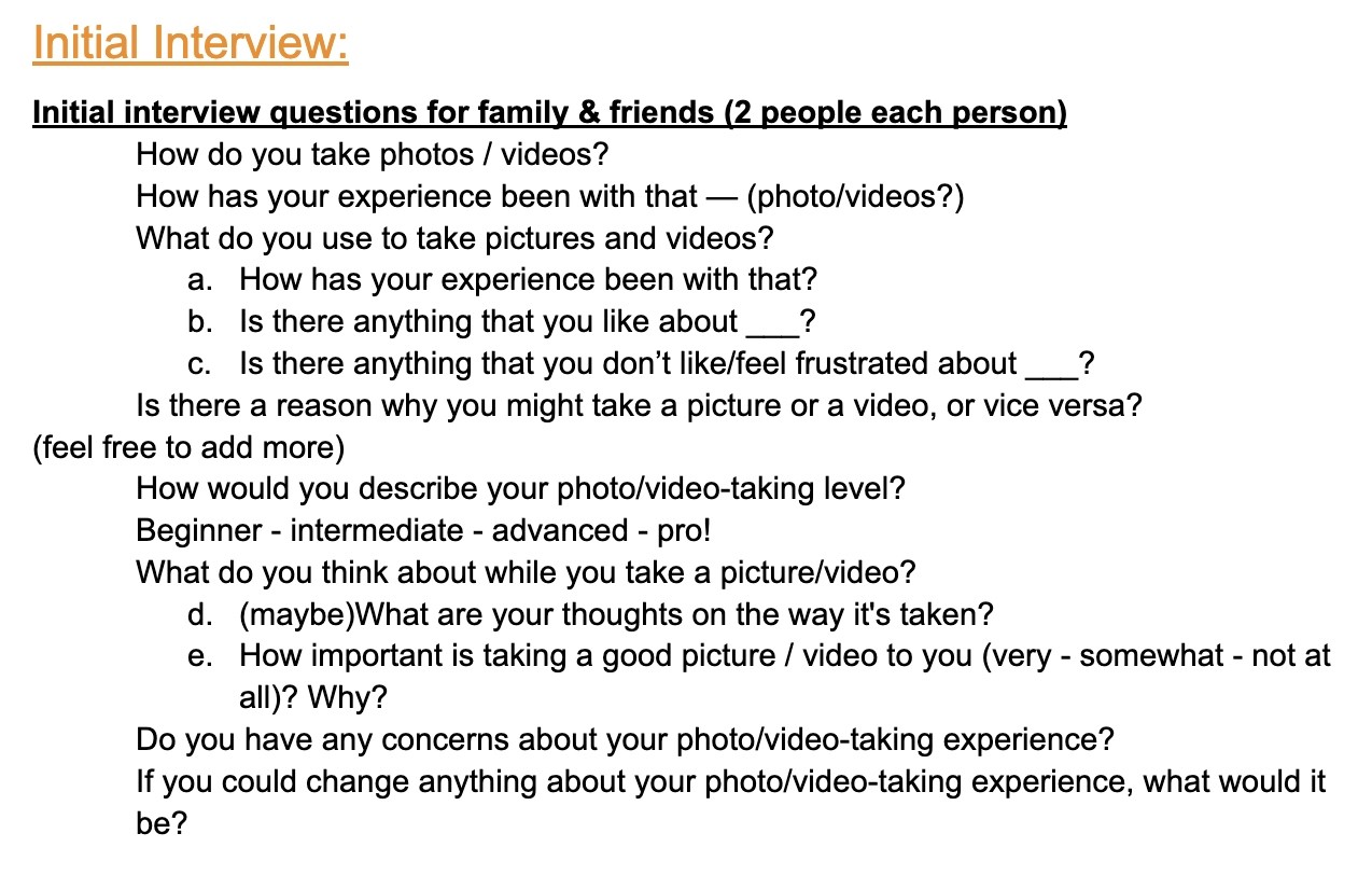
Initial Interviews
For our initial interviews, we reached out to our friends and family who had varied levels of expertise in photography as we wanted to get a broad understanding of how people take photos.
Main goals of initial interviews:
understand their current photo/video taking experience, and how they go about it
discover pain points people came across when taking photos and/or videos
what improvement could be made to enhance their current experience.
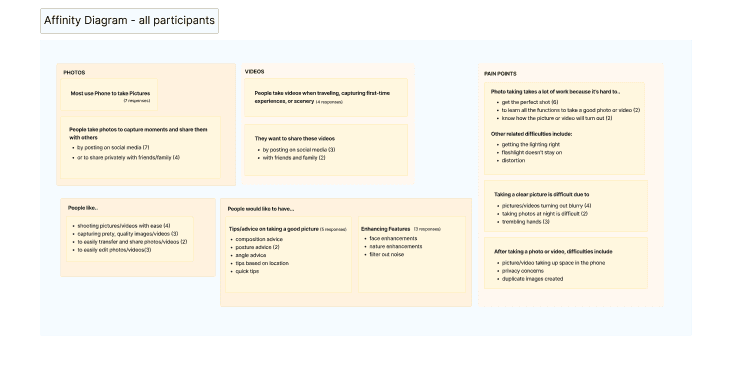
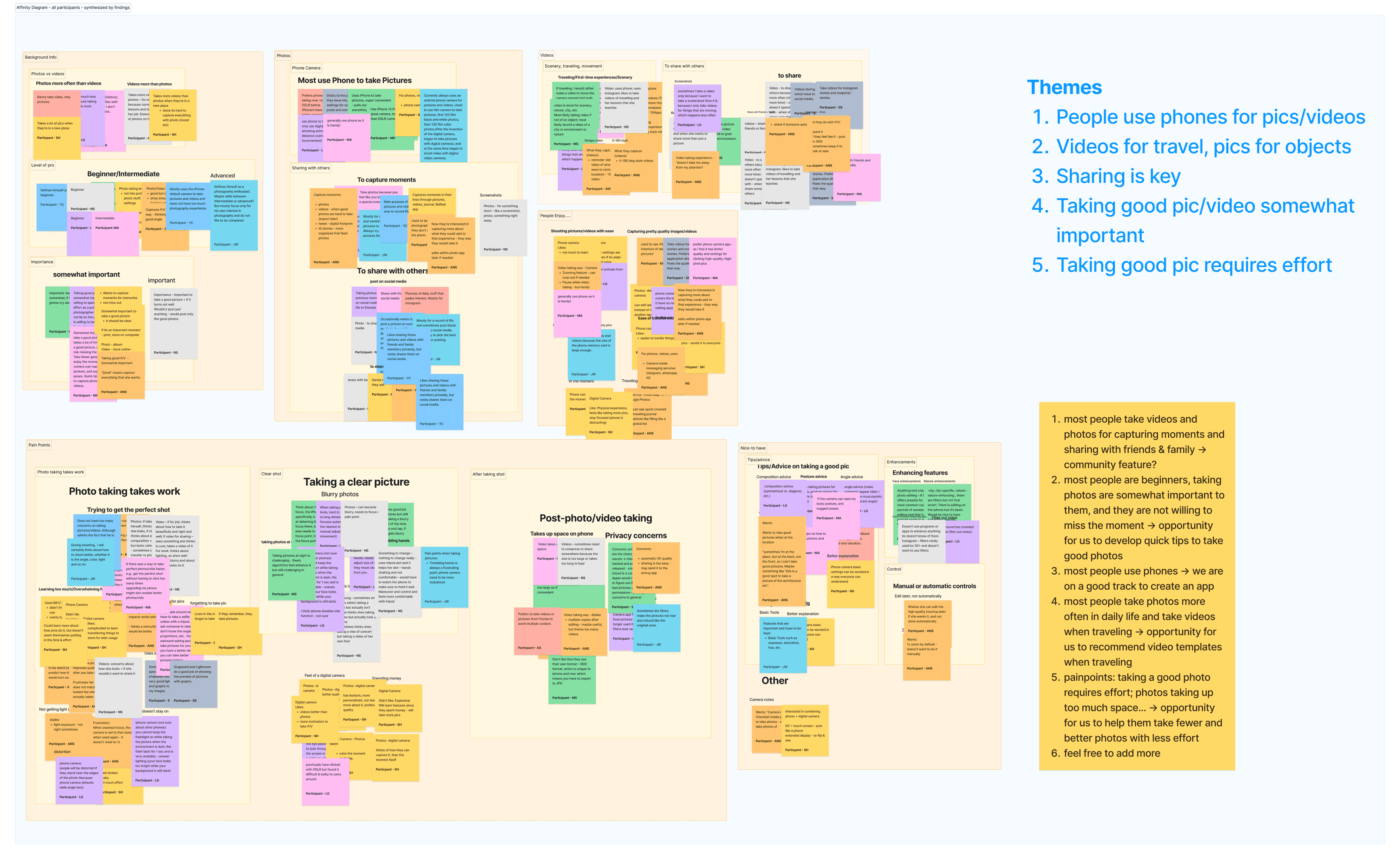
Synthesis
We learned that overwhelmingly, people use their phones for taking photos and videos and are more likely to take videos when travelling or visiting a new place.
Interviewees mentioned they want to take a nice photo or video to share with family and friends
They also expressed that taking a good shot requires a lot of effort and not everyone is a “pro”.
Survey
We conducted a Qualtrics survey to help narrow down features people would find most beneficial for their use. Shared through friends, family and across various Facebook groups and mailing lists, we collected over 80 responses.
Main questions we wanted to know more about:
what apps people use to take photos/videos
what their main goals are
list of features they would like a photo/video-taking app to have
a question ranking those selected features in terms of priority
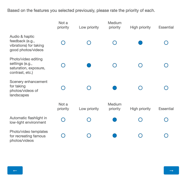
Synthesis
Similar to what we heard from the initial interviews, people responded that they enjoyed taking photos & videos primarily on their phone to record a moment and share with friends & family.
Based on the responses, 9 features were selected as a “high priority” over 20+ people, and we decided to include them in the design some of which include:
image/video stabilization for shaky hands
real-time angle/posture/composition suggestions
scenery enhancement for taking photos/videos of landscapes
filter recommendations for photos/videos
Although photo/video templates for recreating famous scenes was not a feature selected by many, out of those who did select it, 38% deemed that feature as a high priority. Because of this and the fact that this feature would help us differentiate on the market, we decided to keep this feature.
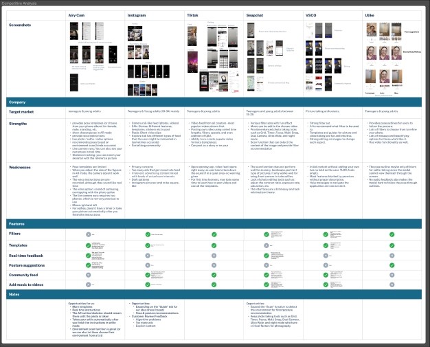
Competitive Analysis
We conducted competitive analysis to see what the current photo/video taking applications offer. We analyzed apps like Instagram, Snapchat, TikTok, VSCO, AiryCam and Ulike and discovered that most applications have templates that allow users to take certain photos or videos but few have real-time feedback for poses, positioning of the camera, and lighting. Although most apps had a social aspect to it, we decided not to add it since it would divert the main features of the app.
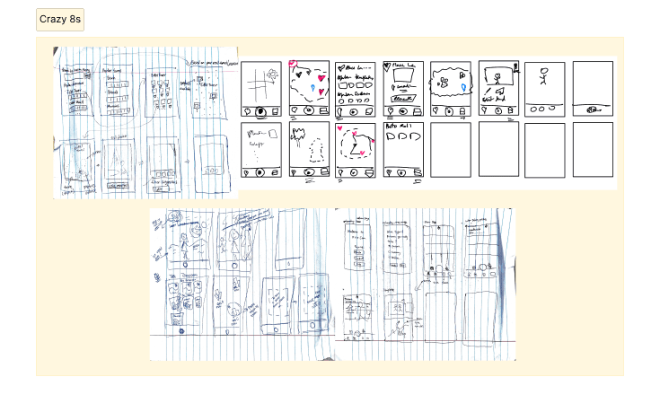
Brainstorming
To combine our findings from the initial research and gather our thoughts, we carried out a Crazy 8s activity to see how each of us visualized the app and get a shared alignment. We focused on sketching on the key features and screens such as
the camera flow where users would take pictures using the templates
search functionality for finding templates
map functionality to find templates based on location
Sketching
Sketching
Sketching
Sketching
Design
Using the crazy 8s sketches, we all came to a shared understanding to start sketching the initial wireframes of the app.
This includes features like:
Search: for templates
Map: Find templates based on location
Real-time feedback: Capture photos & videos with real-time feedback (angle etc.)
Recommendations: Suggestions on poses, gestures and facial expressions
Gallery: View photos/videos captured, saved templates (with map)
Editing: Edit photos & videos taken
Concept Testing
To understand whether there is value in our ideation, we wanted to set up the environment loosely to allow for open feedback from the participants. Our implementation for concept testing were handdrawn sketches to communicate to participants that this is a "work-in-progress" idea. The moderator showed 1 screen at a time and asked the participants to take a few moments to see the screen and think-aloud. Based on their feedback, the moderator would ask follow-up questions if needed.
Setup: Semi-unstructured interview
Participants: 10
3 previous participants (from initial interviews for longitudinal measures)
7 new participants
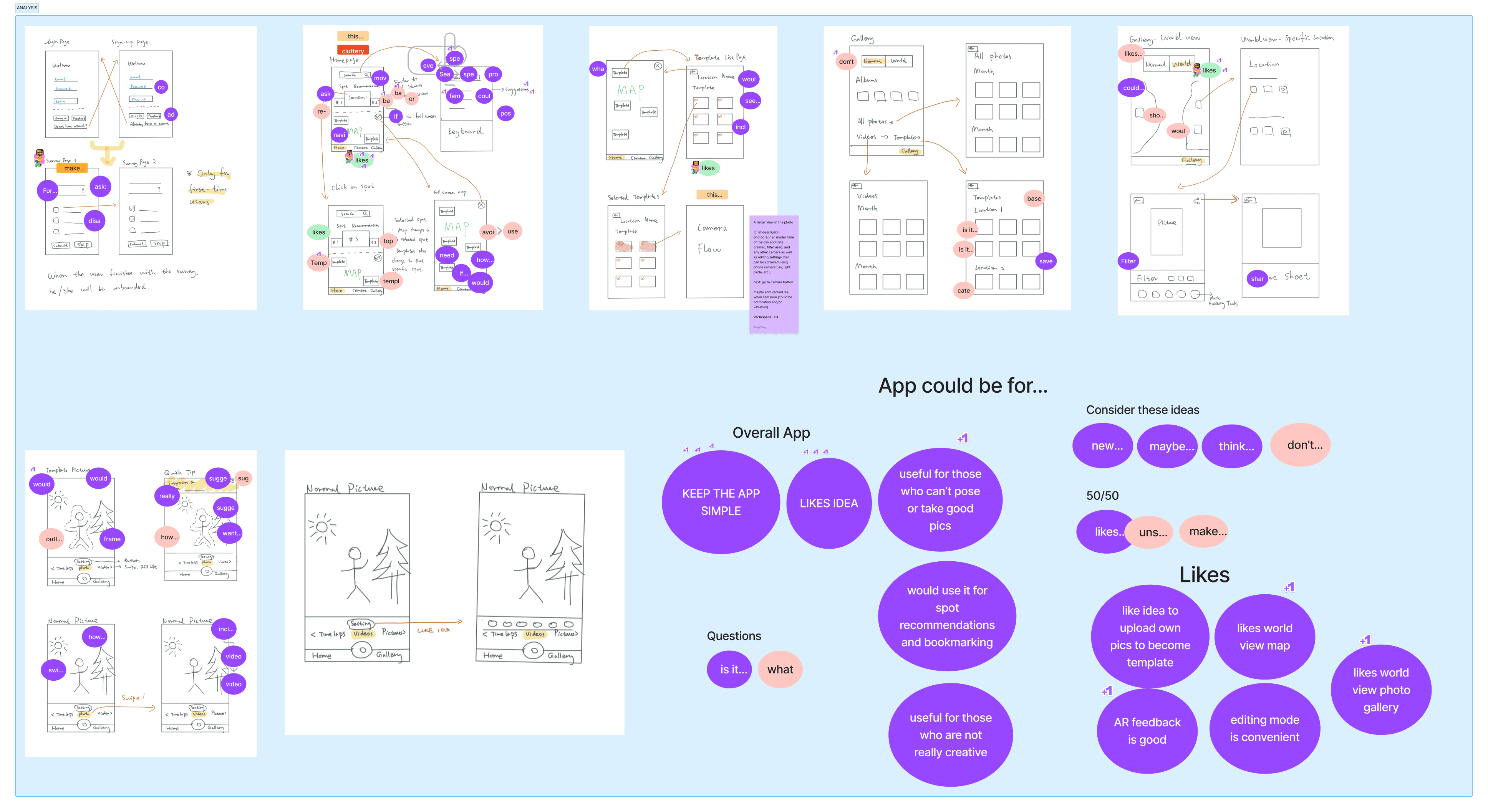
Feedback
What worked well:
Participants liked our idea and thought it would be useful for:
those who are not good at posing, taking good photos, or for those who are not very creative
to get spot recommendations and bookmarking
Some concerns:
Most participants also expressed that these features although useful, must be kept as simple as possible.
Participants expressed to expand beyond “recreating movie scenes” to other general features like pose recommendations.
With these insights in mind, we moved to designing and increasing the fidelity of our screens.
Lo-Fi
Lo-Fi
Lo-Fi
Lo-Fi
Diverging
Based on the findings from the concept testing, we also looked closer into our competitive analysis to see what the current market offers. Each member then designed their ideation for each screen to gather various possibilities for the design. This helped us to discuss these different ideas and get aligned on the lofi design.
Converging: Design Flows
To ensure we all had the shared understanding, we discussed user flows for each part of the app such as:
Home, Screen, Map, Profile
Video template flow
Photo template flow
Edit, Share screen
Converging: Design Flows
To ensure we all had the shared understanding, we discussed user flows for each part of the app such as:
Home, Screen, Map, Profile
Video template flow
Photo template flow
Edit, Share screen
Converging: Design Flows
To ensure we all had the shared understanding, we discussed user flows for each part of the app such as:
Home, Screen, Map, Profile
Video template flow
Photo template flow
Edit, Share screen
Converging: Design Flows
To ensure we all had the shared understanding, we discussed user flows for each part of the app such as:
Home, Screen, Map, Profile
Video template flow
Photo template flow
Edit, Share screen
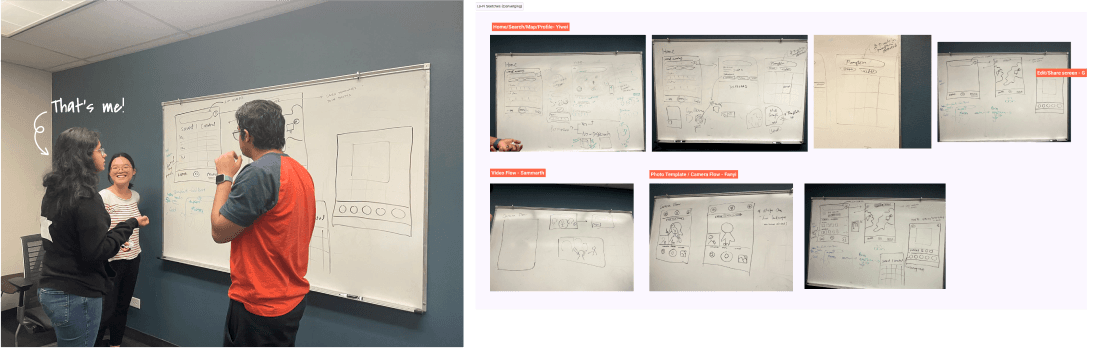
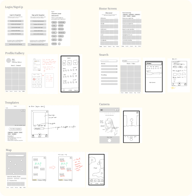
Lo-Fi Designs
Through the findings from the concept testing and the diverging & converging activity, we designed our first lo-fi designs.
Lo-Fi Designs
Through the findings from the concept testing and the diverging & converging activity, we designed our first lo-fi designs.
Lo-Fi Designs
Through the findings from the concept testing and the diverging & converging activity, we designed our first lo-fi designs.
Lo-Fi Designs
Through the findings from the concept testing and the diverging & converging activity, we designed our first lo-fi designs.
Mid-Fi
We wanted to increase our fidelity before testing with participants.
Mid-Fi
We wanted to increase our fidelity before testing with participants.
Mid-Fi
We wanted to increase our fidelity before testing with participants.
Mid-Fi
We wanted to increase our fidelity before testing with participants.
Design
With the lo-fi designs combined with the converging activity, each member designed a mid-fi of a specific flow (some of my contributions below). We also used results from the concept test and survey to help guide us in the selection of features we wanted to include during this phase.
Design
With the lo-fi designs combined with the converging activity, each member designed a mid-fi of a specific flow (some of my contributions below). We also used results from the concept test and survey to help guide us in the selection of features we wanted to include during this phase.
Design
With the lo-fi designs combined with the converging activity, each member designed a mid-fi of a specific flow (some of my contributions below). We also used results from the concept test and survey to help guide us in the selection of features we wanted to include during this phase.
Design
With the lo-fi designs combined with the converging activity, each member designed a mid-fi of a specific flow (some of my contributions below). We also used results from the concept test and survey to help guide us in the selection of features we wanted to include during this phase.
Usability Testing
We wanted to hear more feedback on our mid-fi screens, so we conducted moderated sessions and encouraged participants to think aloud.
Usability Testing
We wanted to hear more feedback on our mid-fi screens, so we conducted moderated sessions and encouraged participants to think aloud.
Usability Testing
We wanted to hear more feedback on our mid-fi screens, so we conducted moderated sessions and encouraged participants to think aloud.
Usability Testing
We wanted to hear more feedback on our mid-fi screens, so we conducted moderated sessions and encouraged participants to think aloud.
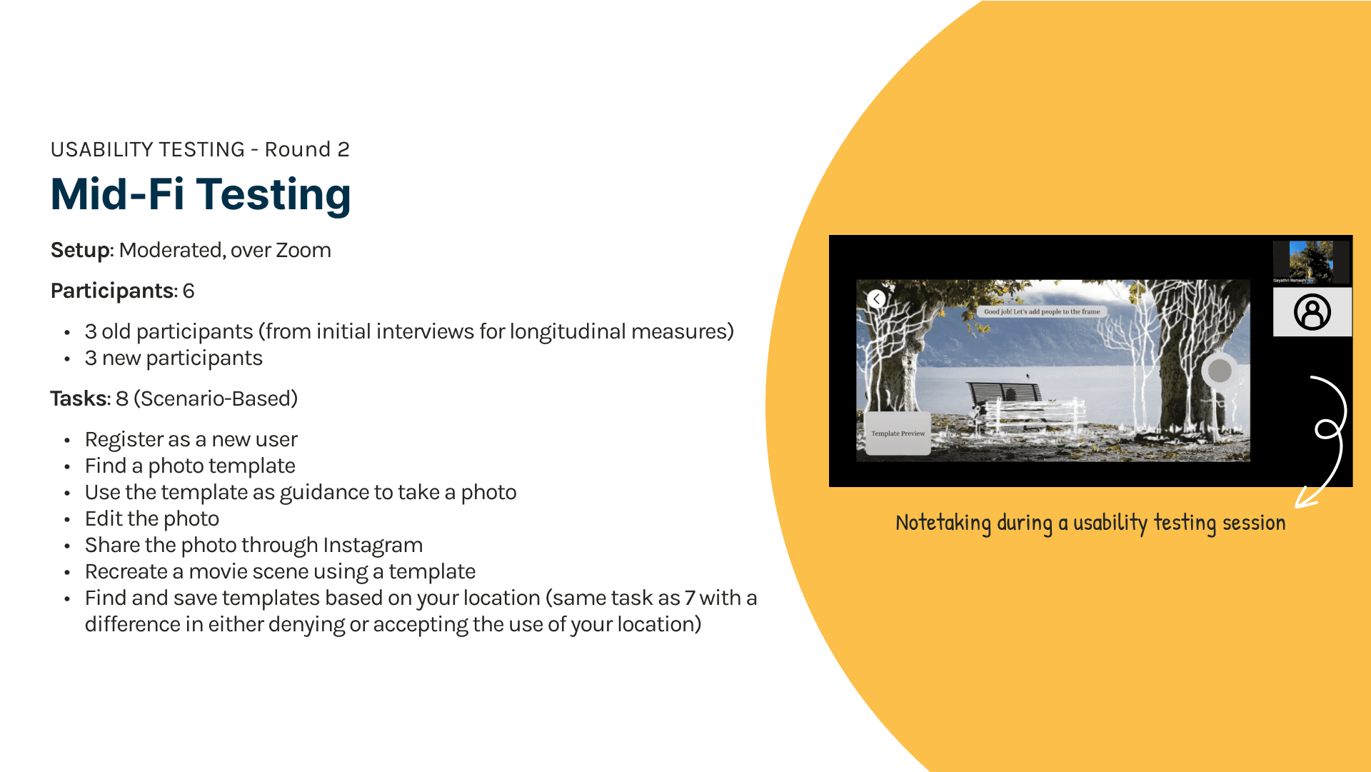
Feedback
SUS Evaluation:
The SUS score was calculated based on 6 participants (both old & new) for 8 tasks. The SUS for our Mid-fi design was 76.25. While A SUS score of 68 is typically deemed as average usability, through the feedback it seems that the mid-fi design was usable but there was some work to be done. Thus, we continued to improve the app experience by working on the feedback and increasing the fidelity of the design.
Insights:
We found that people had trouble with the following:
understanding what exactly needs to be typed into the search bar, as our placeholder text “Type anything” was not descriptive enough
knowing how many steps are in the camera flows
some of the real-time feedback in the camera flow were unclear
people couldn’t browse locations in the map
With this in mind, we made changes by
adding specific instructions like “Search Barton Springs”
adding a progress indicator on the flows
adjusting real-time feedback to make them more clear
adding a browsing function in maps
To learn more about the task plan, go to: Task Plan & Moderator Script
To see usability session notes, go to: Mid-Fi Usability Testing: Interview Notes
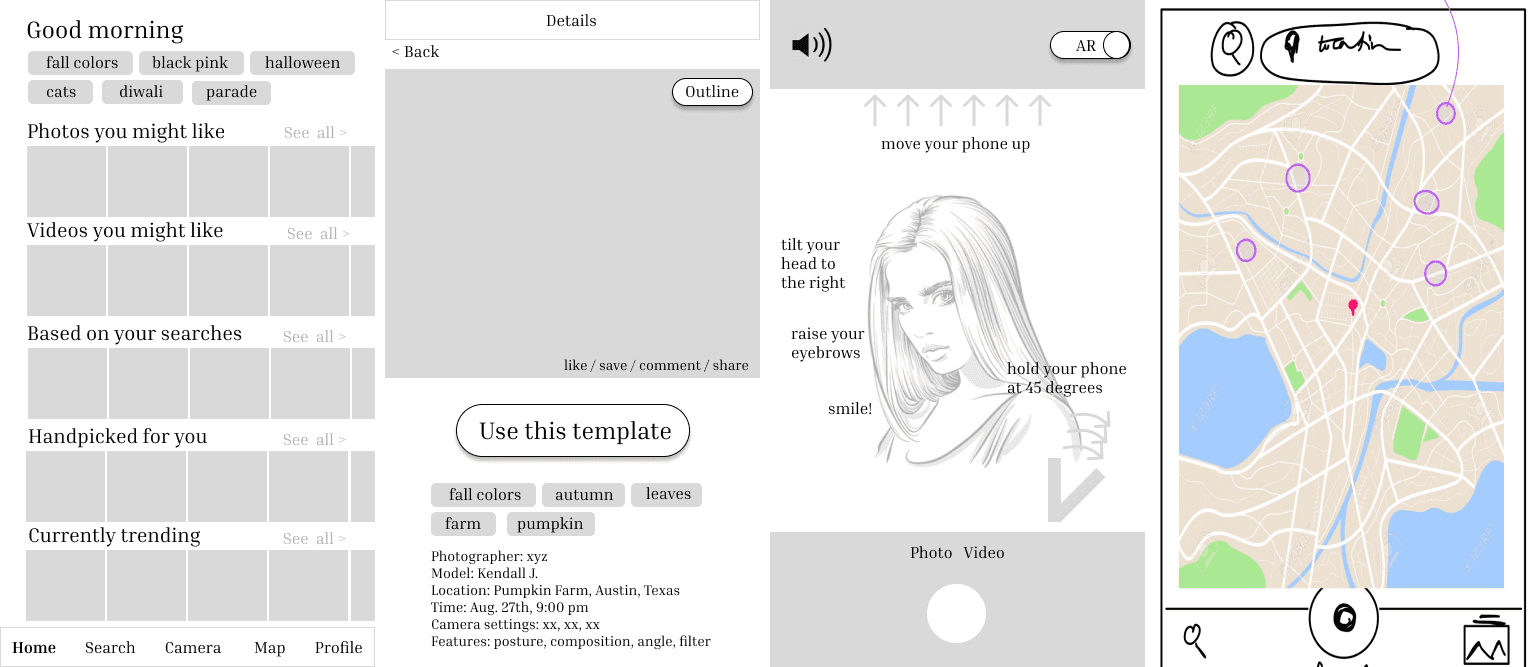
Hi-Fi
We collected user feedback through the think-aloud process, follow-up questions and post-test SUS questionnaire. The overall average SUS the was calculated based on 8 participants feedback, was 73. While a SUS score of 68 is typically deemed as average usability, although the design could be usable, there were some growth opportunities.
Design System
For the design system, we reviewed colors camera phone apps used and used Phosphor icons for our iconography to developed a general components system as well.
Design System
For the design system, we reviewed colors camera phone apps used and used Phosphor icons for our iconography to developed a general components system as well.
Design System
For the design system, we reviewed colors camera phone apps used and used Phosphor icons for our iconography to developed a general components system as well.
Design System
For the design system, we reviewed colors camera phone apps used and used Phosphor icons for our iconography to developed a general components system as well.
Iteration
Based on insights from mid-fi testing and the design systems, we designed the hi-fi screens.
Iteration
Based on insights from mid-fi testing and the design systems, we designed the hi-fi screens.
Iteration
Based on insights from mid-fi testing and the design systems, we designed the hi-fi screens.
Iteration
Based on insights from mid-fi testing and the design systems, we designed the hi-fi screens.
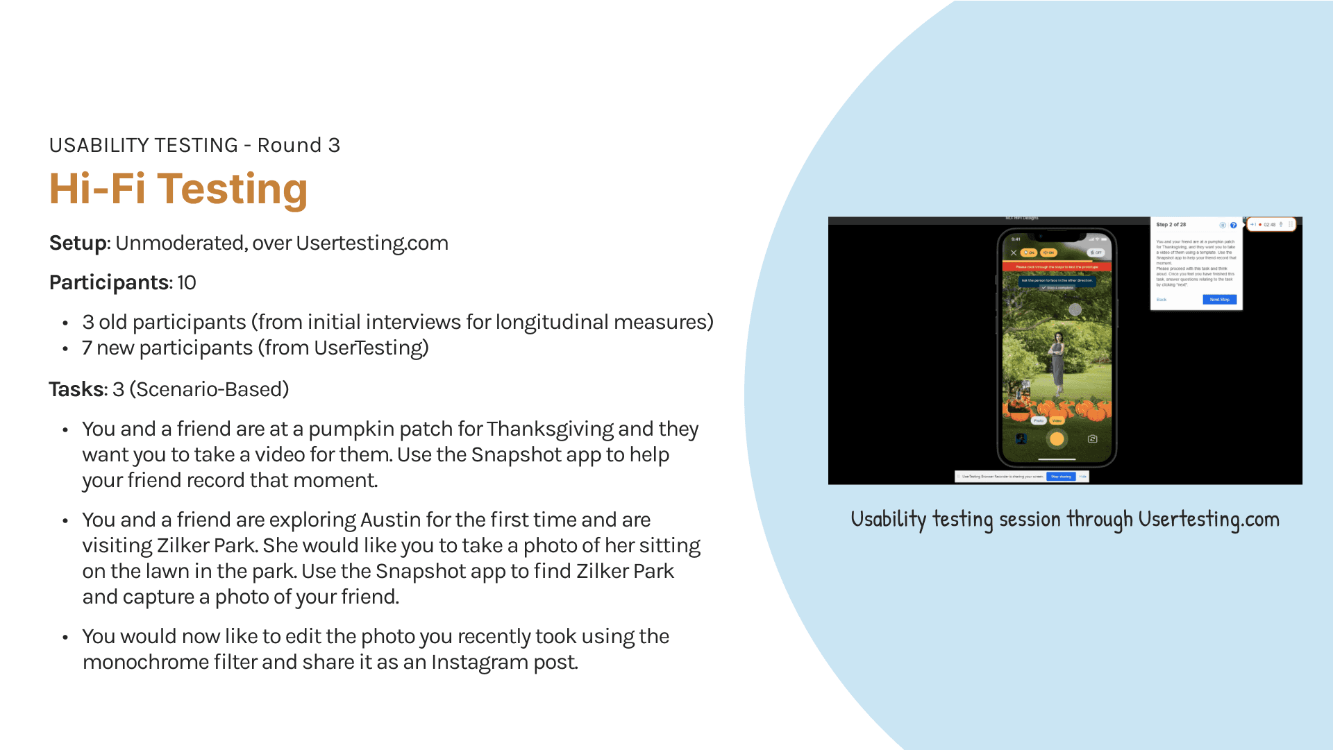
Usability Testing
We conducted unmoderated usability testing since we gathered a lot of quality feedback in our past sessions and only wanted to observe our improvements at work.
Usability Testing
We conducted unmoderated usability testing since we gathered a lot of quality feedback in our past sessions and only wanted to observe our improvements at work.
Usability Testing
We conducted unmoderated usability testing since we gathered a lot of quality feedback in our past sessions and only wanted to observe our improvements at work.
Usability Testing
We conducted unmoderated usability testing since we gathered a lot of quality feedback in our past sessions and only wanted to observe our improvements at work.
Feedback
SUS Evaluation:
The SUS score was calculated based on 10 participants (both old & new) for 3 tasks. The SUS for our Mid-fi design was 82.27. It is to be noted that this test had 3 tasks that the participants had to work on, which is lesser than the Mid-Fi usability session. Based on this information, it seems that the hi-fi design was usable. However, we want to improve the app experience by working on the feedback to ensure that the app is cohesive.
Insights:
Overall, we had great feedback from the participants and some even wanted to see this app implemented! There were still a few things we needed to improve on.
This included:
removing the automatic switching of the steps and screens in the camera flow, as participants wanted to click through and read the instructions given
adding a description of what templates were, as participants were unclear what the images were on the home page
refining real-time feedback, as some was still not clear
the “checkmark” button, indicating that a user was done editing was not clear, so we added the text “done” next to i
View the full analysis on FigJam.
View the usability testing notes on Sheets.
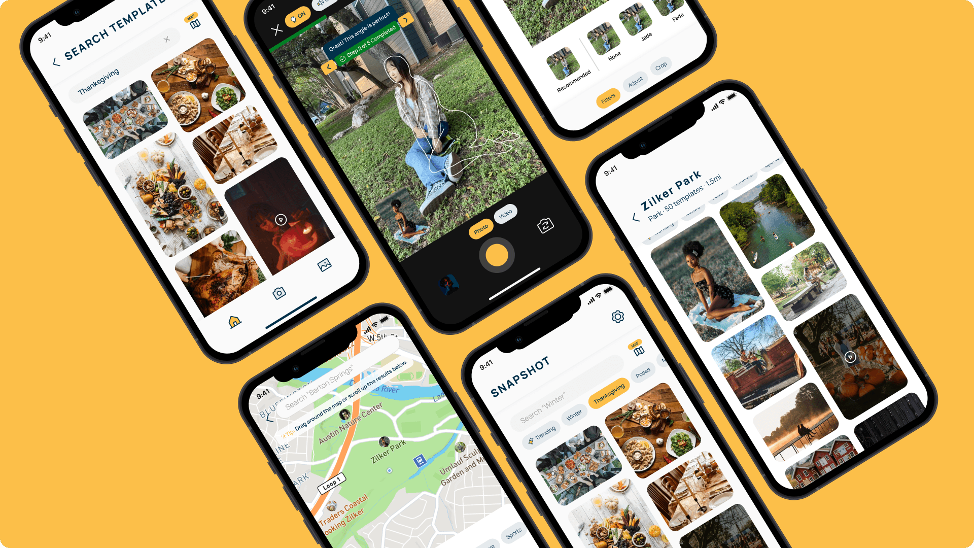
Final prototype
From the findings we discovered by testing our high-fidelity screens, we made changes to our screens, producing our final prototype.
Final prototype
From the findings we discovered by testing our high-fidelity screens, we made changes to our screens, producing our final prototype.
Final prototype
From the findings we discovered by testing our high-fidelity screens, we made changes to our screens, producing our final prototype.
Final prototype
From the findings we discovered by testing our high-fidelity screens, we made changes to our screens, producing our final prototype.
Final Prototype: Prototype
Final Prototype: Prototype
Final Prototype: Prototype
Final Prototype: Prototype
Conclusion
Conclusion
Conclusion
Conclusion
Lessons learned
The process may take twists, turns and dead-ends, and it's all okay! Fail fast and fail often - there are still things to be learned from that!
Trust & communication in the team is important to leverage each of our diversities, and strengths and have each other's backs.
Lessons learned
The process may take twists, turns and dead-ends, and it's all okay! Fail fast and fail often - there are still things to be learned from that!
Trust & communication in the team is important to leverage each of our diversities, and strengths and have each other's backs.
Lessons learned
The process may take twists, turns and dead-ends, and it's all okay! Fail fast and fail often - there are still things to be learned from that!
Trust & communication in the team is important to leverage each of our diversities, and strengths and have each other's backs.
Lessons learned
The process may take twists, turns and dead-ends, and it's all okay! Fail fast and fail often - there are still things to be learned from that!
Trust & communication in the team is important to leverage each of our diversities, and strengths and have each other's backs.
Retrospect
If we had more time, we could’ve widened the range of our participants.
Had we started the project earlier in the semester, we may have been able to space out testing, analysis and design and also expand more technical features
Retrospect
If we had more time, we could’ve widened the range of our participants.
Had we started the project earlier in the semester, we may have been able to space out testing, analysis and design and also expand more technical features
Retrospect
If we had more time, we could’ve widened the range of our participants.
Had we started the project earlier in the semester, we may have been able to space out testing, analysis and design and also expand more technical features
Retrospect
If we had more time, we could’ve widened the range of our participants.
Had we started the project earlier in the semester, we may have been able to space out testing, analysis and design and also expand more technical features